The Shortcode Layout Tools were designed to help you to achieve exquisite and unique layouts in so easy ways. There are two layout shortcodes: Columns and Row.
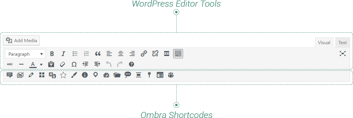
This type of shortcodes have the specific feature for allowing any kind of content to be added, edited and embellished inside them, by using any tools the WordPress Editor comes with and any Shortcodes Ombra Theme offer.
Put the content you need where “Content goes here” text appears and your are almost done.
Keep in mind The both layout shortcodes — Columns and Row — are container elements. It means they accept any other shortcode to be inserted in.
A powerful advantage of Layout shortcodes is that you can insert any type of shortcode inside them and you can embellish the content inside them with any tool WordPress Editor offers.
Keep in mind The layout shortcodes will always take the width of their container elements. In case they are inside other shortcode, they take its width.
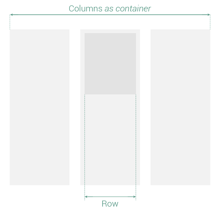
Columns represents a Layout shortocode that helps display easily the content, by creating vertical sections. It is a container element you can add other elements in, including different types of shortcodes. Columns shortcode has the following options:
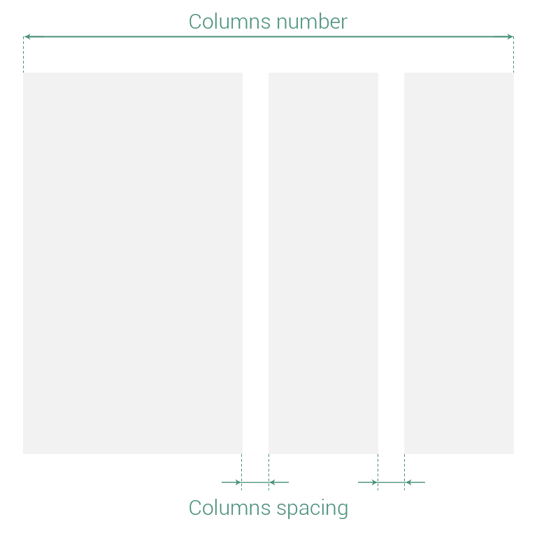
- Number — number of columns the content layout is divided in: 2, 3, 4, 6 or 12 columns
- Size — size of each column is changeable via a simple and intuitive slider interface. Simply choose how many columns you want and then drag the sliders to select the proportions of each column
- Spacing — the space between columns measured in pixels
- CSS class — if it’s necessary to add more style rules
Row represents a Layout shortocode that helps display easily the content, by creating horizontal sections. It is a container element you can add other elements in, including different types of shortcodes. Its options are classified in three main groups:
- General Properties — affect Row shortcode as whole item
- Background Properties — affect background image and/or color
- Content Properties — affect any text element, any image or shortcode inserted here
General Properties
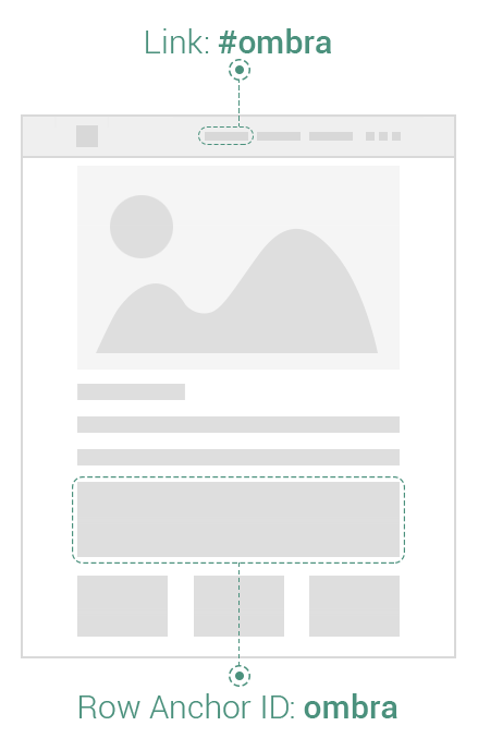
- Anchor ID — useful when you want to scroll to Row element by clicking on another link from the same page. For example, if the Anchor ID is “ombra”, then you could add the following expression “#ombra” to any link href, including the URL of Site Header menu items. You could also use it in order to build One Page sites.
- Paddings — are used to generate space around Row.
- Margins — are used to generate space around Row outside Paddings. You could also use negative values in order to get the Row out of default layout.
- Borders — are used to generate boundaries, with different widths, around Row, between Paddings and Margins.
- Borders color — choose a specific color for borders
Keep in mind Find out more about the way Paddings, Margins and Borders are displayed and how to add their values correctly.
Paddings, Margins and Borders are used to generate custom spacing on all the sides of Row shortcode: top, right, bottom or left. They are measured in pixels.
- Position — useful when you want to position Row element above other elements. If Enabled, the following options are available:
- Z-index
- Top
- Right
- Bottom
- Left
Keep in mind If two Rows, added one after another in the page and both having the position Enabled, the Row introduced last in the page will be above, in case they have the same Z-index and intersect each other.
- CSS class — if it’s necessary to add more style rules
Z-index helps you to decide which element stands above another. An element with higher Z-index will stay above another one with lower Z-index. It includes values from -90 to 90.
Feel free to move Row anywhere you want: Top, Right, Bottom or Left side. You could also use negative values to get the Row out of normal layout. Find out more about the differences between Margins and Position values and how they act.
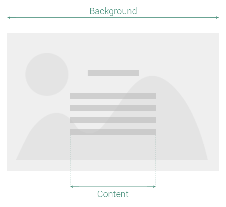
Background Properties
Background Properties applies just when a background image is set up or a background color is chosen. Otherwise, the option like Parallax, will have no effect.
- Image — set up an image as Row background
- Color — color layer that covers the Row background. If the image is also setup, it covers the image. Make the image below visible by adding transparency to color
- Color transparency — background color layer transparency (100% means the color is transparent)
- Height — choose they way you want to add the Height to Row background
- Auto — the height of Row background (implicitly of Row shortcode) will be given by the height of Row content. If no content is added to Row, then the height of Row will be 0.
- Fixed values — the height of Row background (implicitly of Row shortcode) is calculated as percentage from Screen height. So, One Third means the Row shortcode will have a-third-from-screen-height. It admits the following values: One third, Half, Two thirds, Full-height.
- Custom — you are able to add your own height values in pixels.
- Parallax — smooth scrolling effect applied to slider images. It works just when the background image is set up
Fixed values Height is useful mainly when you want to preserve the same proportions of Row shortcode also on other devices, like Tablet or Mobile.
If comparing to Fixed values, Custom Height will change the proportions of Row shortcode depending on Screen size, while preserving Height.
Content Properties
- Width — choose they way you want to add the Width to Row content.
- Auto — the width of Row content will fill the Row background as much as possible
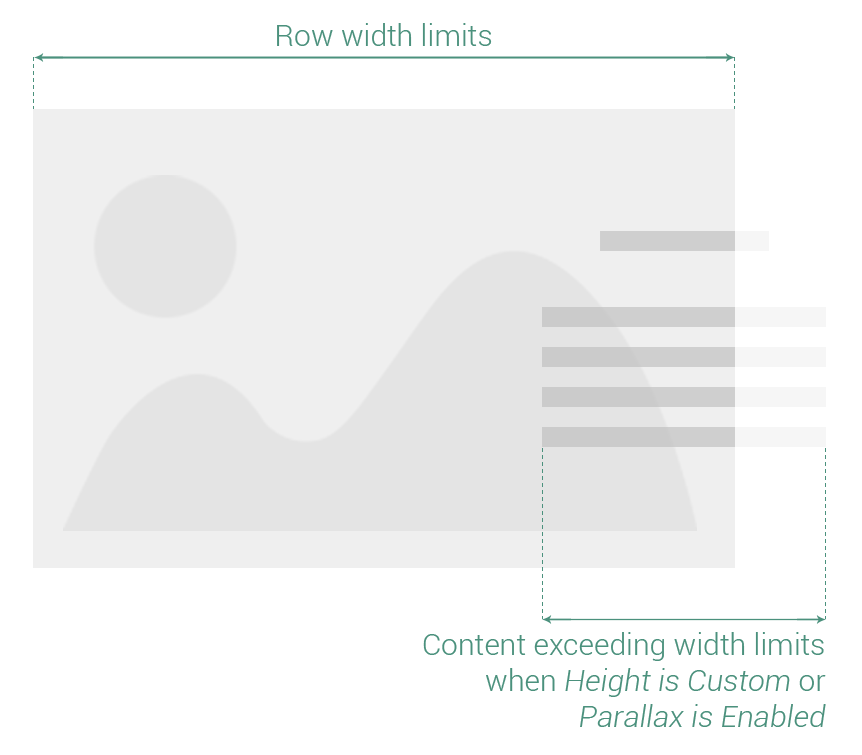
- Custom — you are able to add your own width values in pixels. It is actually the maximum width Row content could take.
- Horizontal position — content could be positioned relative to its background, at the Left, Center or Right side of Row
- Vertical position — content could be positioned relative to its background, at the Top, Middle or Bottom side of Row
If Height is Auto and Parallax is disabled, then you can exceed the Row limits, both width and height, by adding negative margins to Row content.
In case Width is Custom, then try to add a largely enough value to exceed Row width limits.
- Color skin — changes the color of text elements in light (white color) or dark (almost black color). It helps when trying to make a contrast between Row background and Row text content
- Animation — set an entering animation of the elements inside Row
- Animation delay — set a delay time for animation, in seconds — Minimum: 0 seconds, Maximum: 3 seconds
- Paddings — are used to generate space around Row.
- Margins — are used to generate space around Row outside Paddings.
- Borders — are used to generate boundaries, with different widths, around Row, between Paddings and Margins.
- Borders color — choose a specific color for borders
Paddings, Margins and Borders are used to generate custom spacing on all the sides of Row content: top, right, bottom or left. They are measured in pixels.