Any kind of archive or items collection, like Projects list or Album items, could be represented with various exquisite design elements: sliders, carousels, elegant cards.
Each of them are customizable with specific options as you may need different looks in order to diversify your portfolio of works.
Their custom features could be set up, depending on case, in Theme Options — at a global level, in Album / Projects shortcodes popup windows — at a local level or even in Blog Options panel.
The only condition, we recommend for following, is to use these design items wisely, in order to keep a consistent overall look of the site.
Cards
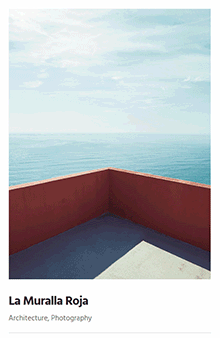
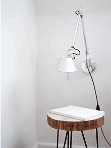
Card is a piece of content that serves as an entry point to more detailed information, even if they could also stand as independent design elements. The cards may contain a unique data set, such as photo, video, text, formatted quote or even link about a single subject. Their size varies if considering you can use elements like landscape or portrait images.
More cards at a time, actually, become convenient means of displaying content composed of different elements. Basically, a collection of cards could represent Projects list, Album items, Related Items (Projects /Posts) or even a Blog, with Posts in the role of cards.
Ombra Theme comes with six types of cards, carefully handcrafted, that are designed to match your tastes while customizing the own portfolio. They behave differently while hovered by mouse.
The first one is Shadow type, which mimics an object with a falling shadow behind. It reminds contemporary art styles, matching well flat design.

The second one — Move type — is designed to express a dynamic movement. It fits well expressive photos, with strong emotions, like fashion sites are.
The third one — Fade type — comes with a fancy and elegant gesture. It is conceived generally for classic portfolios.

The fourth one — Rising type — points out precision and direction. It is seen as a very good option for graphic design portfolios or product design works.
The fifth one — Plain type — is aimed at those who love minimalist approaches for their site.

The sixth one — List type — emphasizes a specific layout from the blogging world. It is designed to keep the information as important as the image that entitles it.

Keep in mind As you have such a great variety of cards, use them creatively in order to personalize each part of your site. For example, you can use:
- Shadow type for Blog and Related Posts
- Move type for Projects and Related Projects
- Fade type for Shop Products
- Rising type for Album Items.
By doing so, your site’s visitors will easily differentiate the site components: Posts from Projects, Projects from Album Items, Album items from Shop products and so on.
The Sliders are ubiquitous in modern web design: they are simple to set up, totally customizable to the look and feel of your site, and allow you to showcase creatively your content.
Sliders can run slideshows automatically without user input by moving slides on predefined time interval. Sliders can also respond to user interaction like click to view next or previous slides.
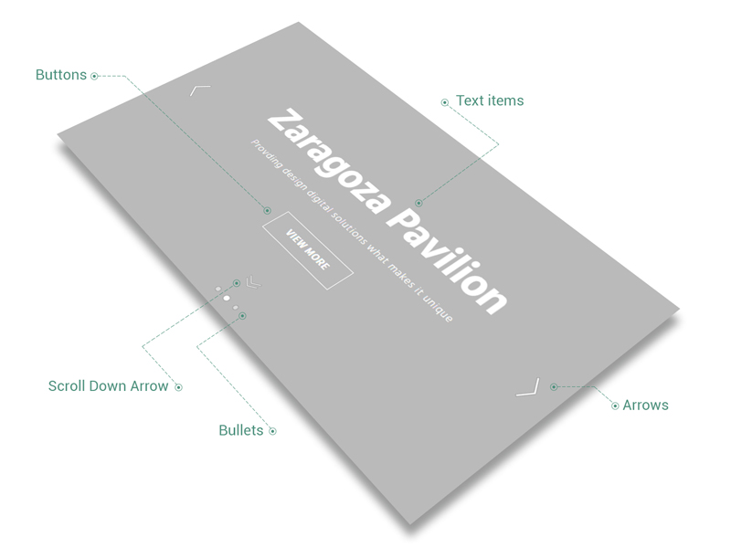
Any slider could contain text items, buttons, media elements like images or videos, animated in two different ways — by fading its items (Fade animation) or by moving them (Move animation) while passing from one to another. Also, they can play automatically, at different speeds, and comprise two kind of tools for navigation: bullets and arrows.
One more thing, you can enable the Scroll Down Arrow (from Projects or Album shortcodes popups), which — if clicked — will scroll the page to the slider’s bottom. This arrow is useful when you decide to set up the Slider to Full-height and want to show to site’s visitor that there is more content to see below the slider.
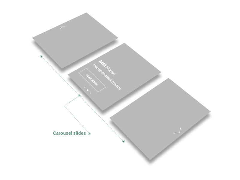
Carousels represent a specific type of slider as they have the same options and behaviour, but with different look. If comparing to sliders, the carousels are able to showcase more than one item (image or video) at a time.
This is why their features are common in Theme Options (Appearance → Customize → General → Slider & Carousel).
Keep in mind If you use Slides Spacing = 0 for Carousel, and you get 1 pixel gaps between slides, in order to avoid them, try to change the height of Carousel, by increasing or decreasing it. If you have a full-height Carousel Slider, and you get the above situation, try to change just one of the dimensions (either height or width) of all pictures from Carousel.
For a better control of Carousel Slides spacing, it is recommended to use pictures with same dimensions inside the same Carousel.