This section allows you to set up Site Content that will affect its look and general functionality. The Site Cotent is that area of site which stays between Site Header and Site Footer. You are able to display here all the information you need for your site.
By understanding each of the options presented below, you will be able to display your content in many creative ways.
Keep in mind For a facile presentation, let’s call Post, Project or Page with the generic term of Single and — when refering to all of them — Singles.
Beyond the Singles pages, your site has also other types of content pages like: Search Page, Categories Page, Tags Page, Latest Posts Page. If comparing to Singles, all of these pages has similar design and structure (as they are Archive Pages). There is also the Attachment Page that is more similar to a Single Page. So, the options from Content → General refer to them.
The next three options — Post, Project and Page — offers you enough customizations in order to make them unique, to give a different look and feeling to each of them. This is the reason they have separate options.
So, in the case of Singles, you are free to create as many designs and layouts as you want, because you have the necessary tools and elements to achieve the desired page. More about this, you could find at Managing content section.
There is also 404 Error Page, with a separate design and layout. It is conceived for those moments when your site has dead ends.
When talking about Featured Branding and Sidebar, you should be aware that both of them represent content elements — they are not content pages by themselves (as Post, Project, Page, Error 404 Page are).
Content settings are as follows:
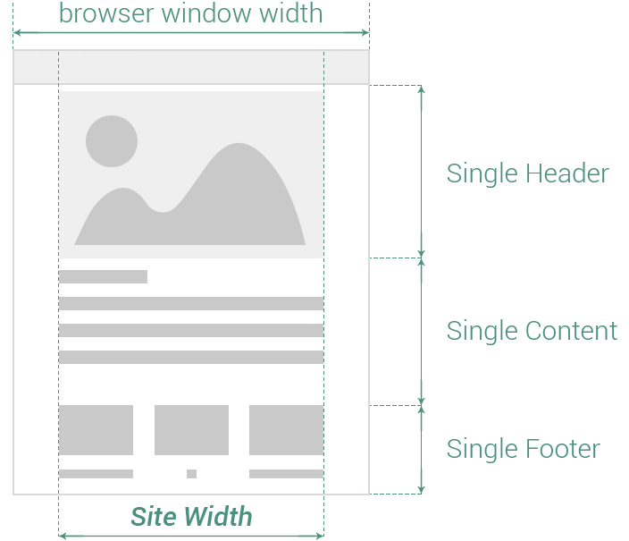
All the Singles have the same structure of elements:
Single Header (Post Header, Project Header, Page Header)
Single Content (Post Content, Project Content, Page Content)
Single Footer (Post Footer, Project Footer, Page Footer)
General
This section allows you to set up general settings for Site Content. The following options are available:
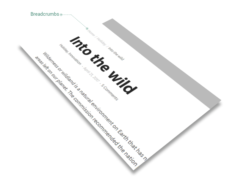
- Breadcrumbs — placed close to any page title.
Breadcrumbs represent a type of secondary navigation scheme that reveals the visitor’s location inside your website.
- Site Header transparency — if this option is enabled, the Site Header becomes transparent and the Site Content is not displayed anymore just below the Site Header, but from the very top of browser window. The option affects all the pages excepting Singles.
- Archive Pages — include Search Page, Categories Page, Tags Page and any archive page WordPress come with. The options below affect just the elements that belong to these pages.
- Display type — the way Related Posts are displayed; choose between 6 types of cards: Shadow, Move, Fade, Rising, Plain or List. Read more about cards.
- *Transparency — overlay color transparency while hovering by mouse. The overlay color is set up in Theme Options when choosing General → Colors → Feature color. It affects just Move and Fade Types
- Columns number — choose how many columns of Related Posts to showcase: 1, 2, 3, 4, 5 or 6
- Columns spacing — enter the spacing between columns, measured in pixels
Posts are entries for creating your site blog, listed in reverse chronological order on that page you set them up. The settings from this section affect globally the Post’s Layout and its necessary spacings, the visibility of its elements and the navigation button.
Keep in mind The are options of Singles — Post, Project, Page — that are similar as terminology and meaning. In order to not repeat all of them, at each Single, we will consider Post as reference Single and — for Project and Page — will emphasize just the options that are different.
Spacing
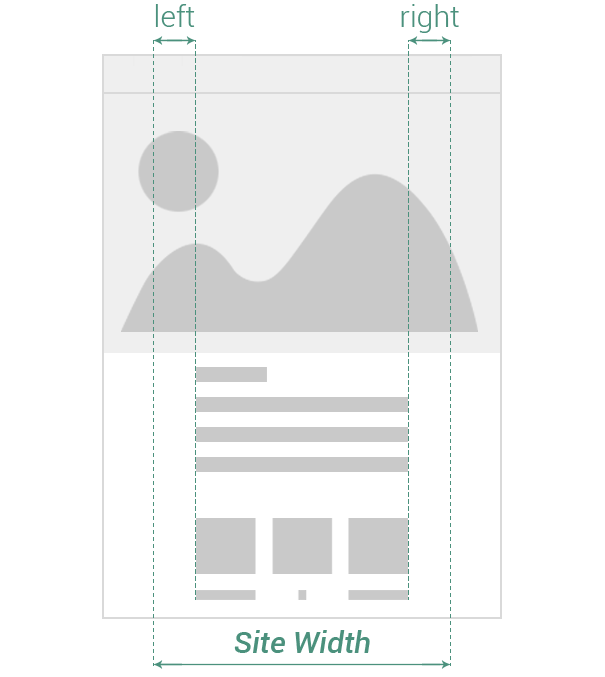
The spacing represents the amount of space Post elements fills up from the total width of browser window. When adding spacing, the width of content is reduced with a certain amount of pixels, either by left or by right side.
- left — add spacing to the left side of Post Content
- right — add spacing to the right side of Post Content
Visibility
The Visibility section helps you to decide which elements of Post will be visible to visitors. It has the following options:
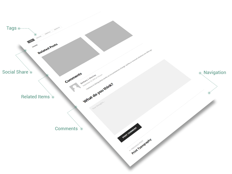
- Tags — it includes the tags specified inside the Post
- Author — if enabled, a post’s author field, including name and biographical information, is inserted right below the post
- Related Posts — located almost at the bottom of Post, there are showcased posts that has the same categories as the actual one. Find out more about Related Items.
- Comments — this option overwrites the Allow comments checkbox from Discussion metabox; it affects all the posts
- Navigation — located at the bottom of Post, the link is conceived to redirect the visitor to the Posts page (or Blog). It includes the Previous Post link, the Next Post link and All Posts link
Related Posts
The following options are available (please read more about Related Items):
- Display type — the way Related Posts are displayed; choose between 6 types of cards: Shadow, Move, Fade, Rising, Plain or List. Read more about cards.
- *Transparency — overlay color transparency while hovering by mouse. The overlay color is set up in Theme Options when choosing General → Colors → Feature color. It affects just Move and Fade Types
- Columns number — choose how many columns of Related Posts to showcase: 1, 2, 3, 4, 5 or 6
- Columns spacing — enter the spacing between columns, measured in pixels
All Posts Link
Enter the link to All Posts Page button, located inside Post Navigation at the very bottom of Post. You could choose any page to be your All Posts Page, even if it is recommended to point the link to the page where you set up the main blog.
Post Excerpt
Define the maximum number of words for Post Excerpt, which is an optional summary or description of a post, in short, a post summary. Find more about Post Excerpt.
Projects are custom entries for displaying your portfolio or works, listed in reverse chronological order on that page you set them up. The settings from this section affects globally the Project’s Layout and its necessary spacings, the visibility of its elements and the navigation button.
Keep in mind We will present just the options that are different from Post options. For more details, check them.
The following options are available:
- Visibility — Tags, Social Share and Comments options are the same as those from Post options
- Related Projects — located almost at the bottom of Project, there are showcased projects that have the same categories as the actual one
- Comments — this option overwrites the Allow comments checkbox from Discussion metabox; it affects all the posts
- Navigation — located at the bottom of Project, the link is conceived to redirect the visitor to the Projects page. It includes the Previous Project link, the Next Project link and All Projects link
- Related Projects — please read more about Related Items. The following options are available:
- Display type — choose between 6 types of cards: Shadow, Move, Fade, Rising, Plain or List. Read more about cards.
- *Transparency — overlay color transparency while hovering by mouse. The overlay color is set up in Theme Options when choosing General → Colors → Feature color. It affects just Move and Fade Types
- Columns number — the way Related Projects are displayed; choose how many columns of Related Projects to showcase: 1, 2, 3, 4, 5 or 6
- Columns spacing — enter the spacing between columns, measured in pixels
- All Projects Link — enter the link to All Projects Page button, located inside Post Navigation at the very bottom of Project
Pages are entries that live outside of the Posts or Projects chronology, and are often used to present timeless information about yourself or your site — information that is always relevant. You can use Pages to organize and manage the structure of your website content. The settings from this section affects globally the Page’s Layout and its necessary spacings and the visibility of its elements.
Keep in mind We will present just the options that are different from Post options. For more details, check them.
The following options are available:
- Visibility — Social Share and Comments options are the same as those from Post options
- Comments — this option overwrites the Allow comments checkbox from Discussion metabox; it affects all the posts
- Navigation — located at the bottom of Page, the link is conceived to redirect the visitor to other pages. It includes the Previous Page link and the Next Page link
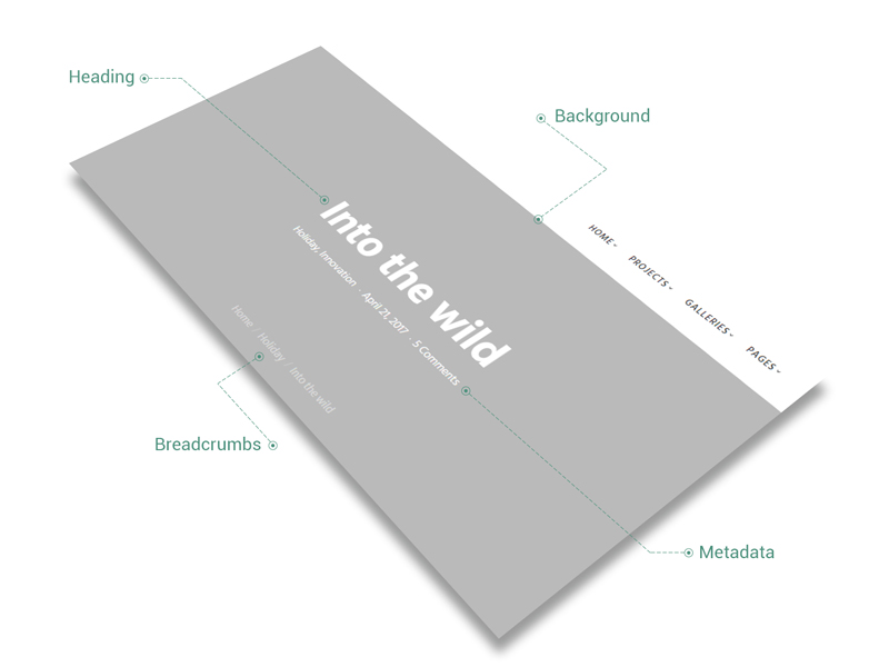
The Featured Branding is a powerful tool of Ombra that enhances the headings of any page. When enabled, it sets up the page heading above all existing content.
The Featured Branding comprises the following elements:
- heading of Single (Post, Page, Project)
- metadata, which could consist of Categories, Date or Comments number
- breadcrumbs
- background, which — depending on case — could be a color, an image or an image with overlay color
In the case of Singles, the Featured Branding can be changed locally by enabling/disabling it. It functions in optimal conditions when the title and Featured Image are both set up. For more information about Featured Branding, please see.
The following options are available:
- Enabled — check this if you want to have a Featured Branding on each Post, Page and Project
- Color style — affects both the overlay color and its transparency
- Overlay color — it covers Featured Image (when it is setup), which is used to fill up Featured Branding
- Overlay transparency — enter a value for overlay color transparency, measured in percents
- Spacing — the amount of space the Featured Branding fills up from the total height of browser window
- Height — enter the height of Featured Branding from the total height of browser window, measured in percents
If the Featured Branding is enabled and Featured Branding image is set up in Theme Options, it appears on any page of your site.
However, it could be replaced locally on Single pages (Post, Project, Page), by choosing another Featured Image.
- Featured Branding image — upload any image to fill up the background of Featured Branding. If no Featured Image is set up, a fill color will be used.
- Parallax — if enabled, parallax scroll effect is applied to Featured Branding image
If your site’s visitors encounter a page not found error, it would be a great idea to present them a message more useful than Not found. Here the Error 404 Page comes: as site administrator, you should always be able to redirect the visitors to a useful page, in case of an error.
The following options are available:
- Color style — affects content items color of the Error 404 Page
- Color skin — color skin of Page items. You could choose between Light (or white) and Dark (almost black)
- Elements — you could customize different elements of Error 404 Page for a meaningful message. Leave empty in case you don’t need a specific element
- Title — enter page title
- Subtitle — enter page subtitle
- Description — enter page description
- Button — it works just if the label is entered.
- Label — enter label for page button. Leave empty in case you don’t need a Button
- Link — enter link for page button