The Header options will affect the Site Header look and functionalities. This section is variable, depending on Layout options like:
Main-navigation → Position
Main-navigation → Type.
In all of the cases, it contains options related to Header layout and Header search area.
However, there are options specific for different typologies of Header, like Sidebar or Menu options.
Header settings are as follows:
This type of Site Header, being the most popular of all, has the most options. It consists of the Logo (standing on its left side), the icons (social icons, search icon, sidebar icon) and the main menu between those two.
Layout
Choose between different properties which will affect color style, spacing or the way the Site Header behaves
- Color style — affects both the backgound color and text items color of Site Header
- Background — background color of Site Header
- Background transparency — transparency level of background color, measured in percents (valid values from 1 to 100)
- Color skin — color skin of Site Header items: menu items, icons, logo. You could choose between Light (or white) and Dark (almost black)

- Spacing — space, either vertical (top & bottom) or horizontal (right or left), around Site Header, measured in pixels
- Behaviour — choose the way Site Header behaves; it could be:
- Regular — this is a standard Site Header that stays on top of the page. When viewers scroll down, it goes out of view. This a good choice if you want a simple and elegant look for your site
- Fixed — this type of Site Header stays fixed on top of the page when visitors scroll. This is a good choice if you want your viewers to have access to Main navigation all the time
- Sticky — this type of header is initially on top of the page and goes out of view when visitors scroll down (after a certain amount of scroll from the page top). This type of behaviour has similarities with both Regular and Fixed header, because it stays Fixed a certain amount of scroll, then goes out of visitors view, like Regular header behaves. It is a good choice if you have content at the top of your pages which you don’t want to obstruct by a fixed header
Menu
This is the most important menu of your site. It has the following options:
- Main menu — the main menu of theme and it refers to first level menu items
- Position — choose an alignment for your main menu inside Site Header: Left, Center or Right
- Font-size — menu items could have a certain font-size, measured in pixels
- Font-weight — how light or bold the menu items could look
- Letter-spacing — the space between letters of menu items, measured in pixels
All the types of Site Headers have mainly the same options as Position Top → Classic, which we will consider the reference Site Header.
However, they differentiate from each other by having specific options or by missing couple of them.
- Submenus — the Dropdown menus of Main menu items
- Color skin — color skin for Dropdown menus. You could choose between Light (or white) and Dark (almost black)
- Font-size — menu items could have a certain font-size, measured in pixels
- Font-weight — how light or bold the menu items could look
- Letter-spacing — the space between letters of menu items, measured in pixels
- Social menu — the social menu of theme, that consists of social icons
- Font-size — social icons could have a certain font-size, measured in pixels
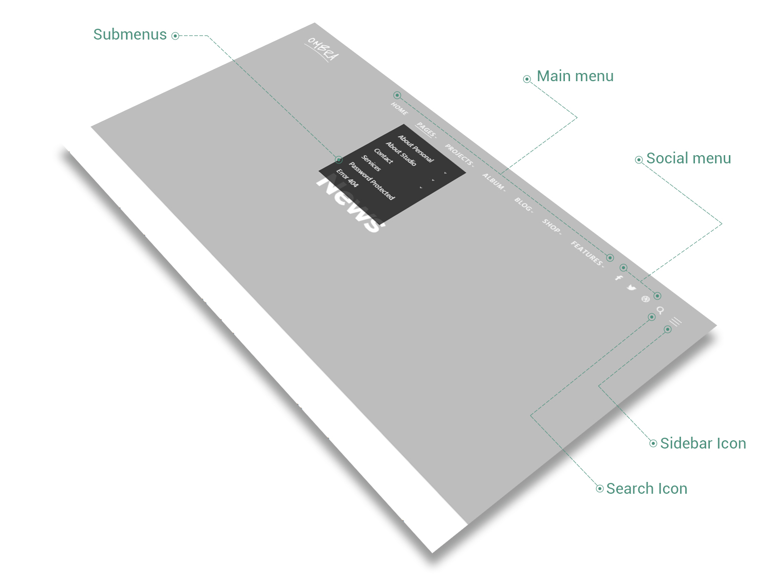
Search Area
When Search Area is enabled, a search icon appears in the Site Header and when clicked, a search bar will unfold, depending on its behaviour, either at the top of the page or in fullscreen mode.
- Enabled — check this if you want to have a Search Area for your site
- Color style — affects both the backgound color and content items color of Search Area
- Background — background color of Search Area
- Color skin — color skin of Search Area items (it refers at those items which appear when Search Area icon is clicked): search text field, explanation text, close-button. You could choose between Light (or white) and Dark (almost black)
- Behaviour — choose the way Search Area behaves; it could be:
- Slide from Window Top — when the search-icon is clicked, the Search Area slides from browser window top, pushing the Site Content to the bottom with a certain amount of pixels
- Covering header — when the search-icon is clicked, the Search Area covers the Site Header with a certain amount of pixels
- Fullscreen — when the search-icon is clicked, the Search Area covers the whole screen
- Text field — this is the text that appears by default in the search field
- Menu icon — the Search Area icon located in Main menu of theme
- Font-size — search icon could have a certain font-size, measured in pixels
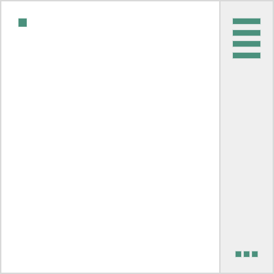
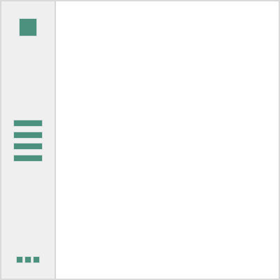
The Sidebar displays information other than the main content of the web page. When enabled, a sidebar icon appears in the header and when clicked, a right sidebar will unfold. You can fill the sidebar with content by adding widgets in Appearance → Widgets.
- Enabled — check this if you want to have a Sidebar linked to the Site Header
- Color style — affects both the backgound color and content items color of the Sidebar
- Background — background color of Sidebar
- Color skin — color skin of Sidebar items (it refers at those items which appear when Sidebar icon is clicked): its title and widgets. You could choose between Light (or white) and Dark (almost black)
- Spacing — the amount of space the Sidebar could have
- Width — sidebar width, measured in pixels
- Top & bottom — vertical spacing around Sidebar content (title and widgets), measured in pixels
- Left & right — horizontal spacing around Sidebar content (title and widgets), measured in pixels
- Title — this is the text that appears by default in the search field
- Menu icon — the Header Sidebar icon located in Main menu of theme
- Size — sidebar icon could have a certain size (small, medium, large), measured in pixels
Mobile Menu
The Site Header of Ombra Theme has a specific look on mobile devices in order to adapt itself to the screen size. As the Site Header appears with a different layout, you might need to change couple of its style options.
- Color style — affects both the backgound color and content items color of Site Header on mobile devices
- Background — background color of Mobile Menu
- Color skin — color skin of Mobile Menu items. You could choose between Light (or white) and Dark (almost black)
It consists of the Logo (big in size, it stands in the center of Site Header, above its icons and the main menu), the main menu and the icons (social icons, search icon, sidebar icon), standing next to the menu.
The options that set apart this type of Site Header from Position Top → Classic are presented below.
Menu
It has almost the same options as Position Top → Classic, but there is one option that missing in this case: Menu → Position (as the menu has just one position).

This type of Site Header is useful when you have a few menu items and want to preserve the site as clean as possible, hiding away the navigation items, like menu, social icons or search tool. This is the reason, the Fullscreen Site Header does not have a Sidebar.
Instead of Sidebar button, this time there will be a Menu icon on the right side of main navigation and when clicked, a fullscreen menu opens.
The options that set apart this type of Site Header from Position Top → Classic are presented below.
Menu
The menu is not visible at first view, it appears just in Fullscreen mode, after clicking the menu button from top right corner of the browser window.
- Color style — affects both the backgound color and content items color of the Fullscreen menu that appears when the Fullscreen menu icon is clicked
- Background — background color of Fullscreen menu
- Color skin — color skin of Fullscreen menu items (it refers at those items which appear when Fullscreen menu icon is clicked). You could choose between Light (or white) and Dark (almost black)
Search Area
It has almost the same options as Position Top → Classic, excepting Behaviour.
Position Top → Aside
As Fullscreen Site Header, this type of header is useful when you have a few menu items and want to preserve the site as clean as possible, hiding away the navigation items, like menu, social icons or search tool.
It is very similar to Position Top → Fullscreen and has exactly same options as it.
This is the reason the Aside Site Header does not have a Sidebar. Instead of Sidebar button, there is a menu icon on the right side of main navigation and when clicked, an aside menu opens.
This type of Site Header is useful when you need a side main navigation, always present on the left part of your site. It stays fixed in place and will not scroll when viewers scroll down the page. It does not have a Sidebar.
It has almost the same options as Position Top → Classic. However, there are options that set it apart.
Layout
The only option that is different from those of Position Top → Classic is presented below.
- Layout → Spacing
- Width — header width, measured in pixels
Search Area
When Search Area is enabled, a search icon appears in the Site Header and when clicked, a search bar will unfold in fullscreen mode. It has almost the same options as Position Top → Classic, excepting Behaviour.
As Top → Fullscreen or Aside Site Header, this type of header is useful when you have a few menu items and want to preserve the site as clean as possible, hiding away the navigation items, like menu, social icons or search tool.
It is very similar to Position Side → Classic and has exactly same options as it.
The unique menu icon on the left side of your site will remind visitor to search for main navigation, which —and when clicked — will make visible the Site Header.
The menu icon stays fixed in place and will not scroll when viewers scroll down the page.
